IDEA: In my previous design, I worked with the idea of contemporary materials (concrete) and traditional materials (bamboo, wood, and rope). I wanted to show how these materials could give off different 'feelings'. I imagined that from the outside of my building, all you'd see was a regular concrete building. But it's not until you enter the building that you discover something different. The interior is very traditional.
I decided to work within 'Short Street.' I realized that although this area contained numerous apartment blocks, there was still no evidence of social interaction. I therefore wanted to a create a space that would encourage social interaction by connecting the buildings together. I decided to work closely with "Seaview apartments." I want the tram route to rise high enough above ground level so that I can get a view of the sea. This would mean that I will be dealing with alot of wind and sunlight throughout the design.
In my previous design, some of the concrete wall was still partly exposed through the gaps between the bamboo. This was deliberate as I wanted to show a connection between contemporary and traditional materials. I wanted to show that both materials can be used in the same context.
Having concrete on the outside implies that the traditional materials on the inside are weak - and therefore need heavy protection from the concrete. This is not the case. I want to take this idea and apply it to my structure (which i haven't yet finalized). I'm thinking about weaving bamboo together, and having some parts of it tied with rope to create some sort of scaffolding structure. The idea is to look at the design and think that it is weak - when in fact, it can be just as strong as any metal scaffolding.
Chosen Site: Apartment Blocks near Short Street and Law Building.
Aerial view of site (1:1000)
An aerial view of the site, and the buildings which are within that area. The light blue circle is where I want to position my stop. It is right at the corner of the parking lot next to 'Seaview Apartments.' These buildings will be connected by the tram stop.
Site Photos:
The parking lot next to Seaview Apartments - where I intend to build my stop :)
The corner of the car park where I plan to design my stop. I chose this spot because it is at the center of the buildings I want to connect together.
Site Analysis:
While sitting outside on the footsteps outside the law building, I noticed that:
-It was cloudy, so there was no sunlight, or any shadows cast by the buildings within the site.
-Traffic was very light. All the cars I saw were just passing the street. No stop overs.
-It was quiet. The most dominant sounds were of traffic passing through Anzac Ave road.
-There were no interesting views. The area was surrounded by high-rised apartments. To me it seemed as though the apartment blocks within the site were challenging each other to go higher so that they could get a better view of the sea.
-It was quite breezy. (Wind tunneling between the buildings)
-Although there were so many apartments, the area seemed "lifeless". There were no obvious communal spaces.
Views:
I couldn't get to the top of the building, so I decided to visit websites that promoted this accommodation area to get photos of the view from the top floors of the building.
Things that were already there:
Car parks, hotels, restaurant, shops along Anzac Ave, roads, Administration House, Law Building.
Thursday 22/09/11 - Desktop Crit.
After getting all the information I needed, I was stuck with a form for my structure. Robertta also said that I need to think about how the building responds to the elements (especially since it's going to be high above the ground) and to condense my ideas because what I had was going to be really tricky.
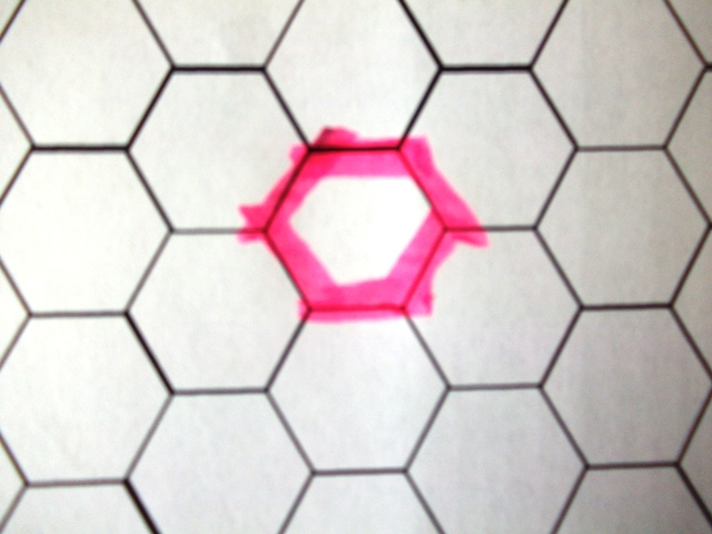
With extra help from our Tuakana mentor, I decided to use the hexagonal shape seen in a wasp's nest as a starting point for creating a form for my structure. The form of my structure would therefore be influenced by the new forms created when part of the nest is affected by wind, rain, and sunlight.
Using a basic hexagon shape, and using it as the plan of the building.
Stacking the hexagon shapes to form a tower that would reach to the top of the building.
PROBLEM, NEW IDEA: For some reason I still wasn't keen on the idea of a "tower." I then thought about a passage from the 'Weather' reading:
"For, indeed, the greatest glory of a building is not in is stones, or in its gold. Its glory is in its Age...it is in that golden stain of time, that we are to look for the real light, and colour, and preciousness of architecture." - John Ruskin, 1849 (p.193).
This got me thinking about how my design (and the idea of weathering) could enhance the existing the building - just like how 'AGE' makes us see the 'real light, and colour, and preciousness of architecture."
I then decided that my stop would be attached to Seaview apartments. Moss grows on bamboo, reflecting a long passing of time. I want to take that same idea and apply to my design. I want my stop to 'grow' around the existing apartment, to give it that sense of 'aging' through time.
I will have four different rooms. One where you can experience SUN, the second RAIN, the third WIND, and the fourth, which will be located at the top of the building, will allow one to experience a combination of the three - including VIEWS.
I still wanted to focus on the hexagon shape. So I decided to make a mock up which would allow me to work out how I would want the four spaces to be attached to the existing building...
Mock up of existing building. Front face of mock-up is facing towards the sea.
Front face of mock-up is facing towards the sea.
Plan View of where for spaces will be on the existing building.
Elevation view. (From Law Building, facing towards Seaview apartments)
How space on the roof of the building will sit.
How the other 3 spaces will be attached to the building.
Thinking about how each room/space will be designed to allow the experiences with the elements:
SUN:

Tiny pieces of hexagons will be cut into the walls of the room to allow bits of sunlight, and casting interesting shadows onto the floors.
RAIN:
Roof allows rain to flow through the building, to create an indoor fountain. Derived from the idea of people gathering around a fountain to have lunch, tea, etc...
WIND:
With the slits, I was thinking about wind tubes and how different notes of sound are produced as wind blows through them. I wanted to focus on the acoustic effect of wind rather than just the feel of it. I want to incorporate the idea that different sizes and widths of tubes can produce different sounds.
COMBINATION:
Ideas from the three spaces combined. The space at the top however, allows for a good view of the sea.
Monday 26/09/11.
After desktop crit today, I still had alot of work to do.
PROBLEM: I needed to find a way to make the form of each space really look as though they were responding to the elements wind, rain and sunlight. The ideas I had looked too "rigid" and didn't really show how a wasps nest was being weathered by these elements. I've also decided to create three spaces instead of four. The space which was supposed to be on the roof - I've ignored. After some thinking I just couldn't see how my original idea of "views" connected to the other three spaces. So! back to the drawing board...
(photos to be uploaded.)