-An augmented drawing to show my building in context.
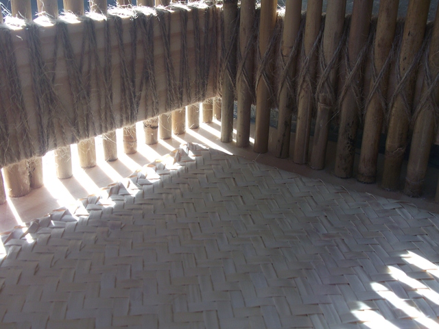
-Complete matrix (I had trouble trying to draw my circular shaped building in axonometric. Hence the reason it was incomplete)
Matrix:

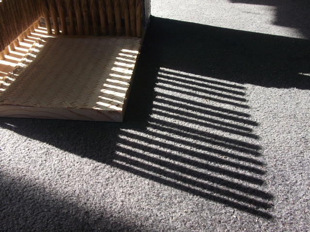
Augmented Drawing of building in context (plan view):


Peer Review:
Group: 2 - Laser Cutting.
Tutor: Robertta and Anthony.
Task: Each had to design a five story building. Each floor was an office space and had it's own distinct funtion.
Task: Each had to design a five story building. Each floor was an office space and had it's own distinct funtion.
Kyle D'Mello (http://dmellok.tumblr.com/).
Kyle's design was influenced by 1960's rock and eastern music.
Kyle's design was influenced by 1960's rock and eastern music.
A club space (for band performances etc.), library (at the top floor) guitar room, recording room, and music room was allocated to each of the five floors. I liked that his idea was based around music - which is something more practical and exciting compared to a quiet, and more formal office space.
I liked how his structure took on an organic form which allowed for movement throughout the space to be "free-flowing". Each floor was interconnected by a spiral of stairs. Nate raised a point about how each floor appeared to be designed around some sort of "pivot point." This was interesting - and this wasn't thought of during the design. What I did find interesting though was that the shape of each floor was intended to reflect the different shapes of guitars. I also liked how he intends to use stained glass on the side where there is maximum sunlight entry. These panels of glass will cast interesting shadows and light onto structures parallel to it.
TIP: ADF lasercutting on upper Queen Street. Good deal!
Louie Tong (http://louievtong.blogspot.com/2011_09_01_archive.html).
The first thing I saw when I looked at Louie's model was black pieces of card, with blobs of bright paint. The contrast between dark and bright colours really attracted me. The blobs of bright pain made the spaces look "busy" and "full of life." It made me think, "yes...there can be excitement inside a dull building."
He was looking at the idea of the "heaviness of materials," hence the use of black card. Each thickness reflected different weights.
His structure was designed to house a photo gallery, spa, travel agency, guitar studio, and a cup cake stall (equipped with its own kitchen and stall). I really liked the position of the photo gallery, which was on the last floor, because it had a huge window overlooking a city view. Each room however, had windows on the side which exposed them to sun light. I also liked how the bottom floor (for the cup cake stall) faced toward the street. Great way to attract customers!
Each floor is stacked above each other - just like the game "tetris."I liked how he incorporated interactive elements like ladders into the structure - it makes the building exciting and adventurous, just like Emily's idea.
I thought that his site (which was in the middle of a car park) was very interesting. Personally, I took this to mean that he wanted to show some sort of relationship between how busy a car park can be, to a busy environment within his structure. But I was wrong. He chose this site because he wanted somewhere "heavy."
To me, this meant that he wanted to show a relationship between how heavily packed a carpark is, and how heavy materials can be within a building.
Hucheng Wu(http://emily-orange.blogspot.com/)
The thing that struck me when I saw Emily's model was how "exiciting" it looked. I liked how she designed it carefully to meet the needs of her clients. For example, the top floor contains a tree house for a travel agent. The travel agent wanted an interesting threshold into the space. For this, Emily decided to use a ladder. She used ladders in other places of the building which sort of made the structure look like a jungle gym! But I liked it! The thresholds were really exciting and adventurous.
Her building was designed to house a basement club, studio for painting and handicrafts (including a space where you can go and buy these handicrafts), an architecture space, a roof garden and a tree house.
The site of her building allowed for a view over the sea. The building itself is also quite open to allow maximum sunlight and a good view of the city. The only space which was slightly different from the others was the club basement. The client for this space didn't want any natural lighting, so Emily put engravings in the wall which would light up using artificial lighting.
TIP: Do things early. Don't leave it to the last minute.
No comments:
Post a Comment